Amplitude – B2B Dashboard Redesign
Redesigned Amplitude’s web dashboard that boosted data clarity and earned a 90% satisfaction rating for ease of use.
Role
Duration
Tools
Team

Project Overview
Amplitude is a leading digital analytics platform that equips users with charts and dashboards to better understand user behavior, identify trends, and turn insights into action.
For four months, I served as a Lead Designer for an Amplitude project through Cal Poly iter8, co-leading a six-person team to improve the chart-to-dashboard workflow and facilitating biweekly check-ins with Jingshu Zhao, Principal Product Designer at Amplitude, to align on project goals and deliverables.
25%
more users felt assured their work is saved
8 → 3
clicks to reach key charts
40s
decrease in workflow completion time
Problem Statement
Many new and returning users drop off Amplitude's application by week two, indicating that the core chart-to-dashboard journey may be a critical pain point
"Users are struggling to navigate the chart-to-dashboard workflow"
- Product Designer @ Amplitude
Research & Discovery
Over 3 weeks, I conducted user interviews and made an impact effort matrix to assess the current dashboard-to-chart experience and build a deep understanding of user pain points.
7
Core Users (new, junior, senior level)
5
User Interviews
4
Critical Pain Points
Identified Critical Pain Points:
Charts are often deleted because users forget to save their work.
1.05k users archived charts in the past 30 days, suggesting users are archiving unsaved charts too.
Key daily call-to-action buttons are hard to find.
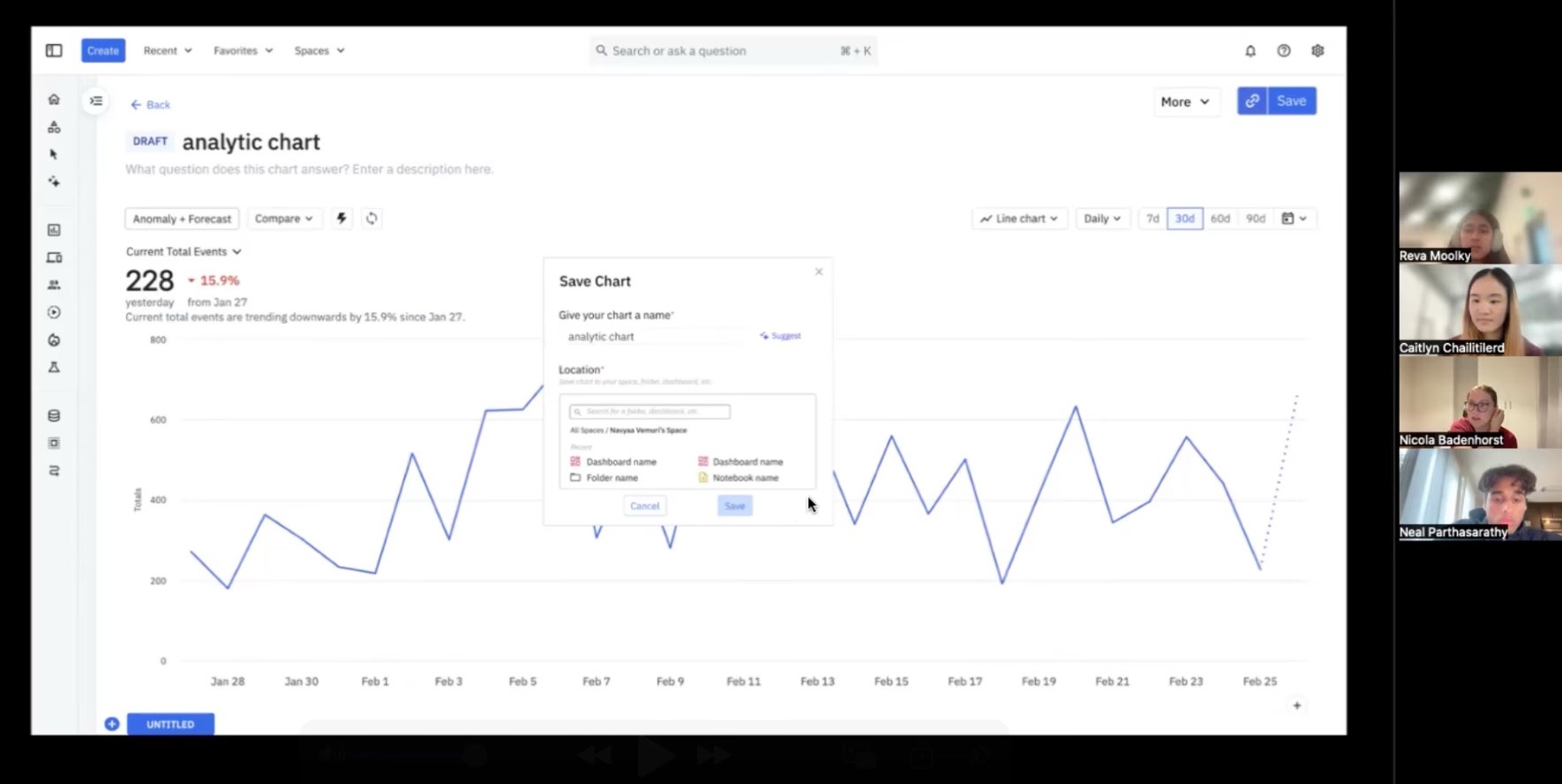
Users open multiple tabs on their browser to work around slow chart load times.
Where Can I Make The Biggest Impact?
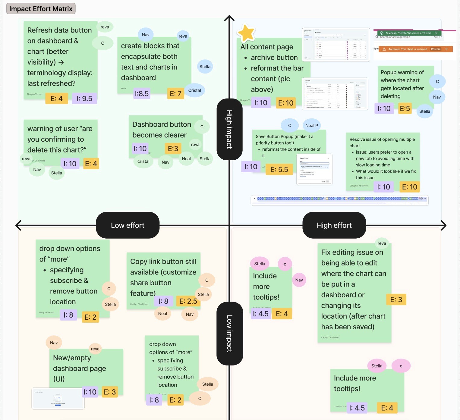
We then used an impact–effort matrix to prioritize features to narrow down what features would bring the most value for both, the users and the business, within our time constraints.
It ultimately showed that we had to reduce friction in the chart-to-dashboard flow and make key call-to-action buttons more prominent and intuitive.
Ideation
From carefully analyzing our user and business insights, I iterated lo-fi to mid-fi designs that focused on consolidating the experience into a single-page flow with more prominent CTA buttons, ultimately helping users spot trends and accessing tools faster.
Feature Ideations:
Multi-tab Feature
Dashbaord Menu

User Flow
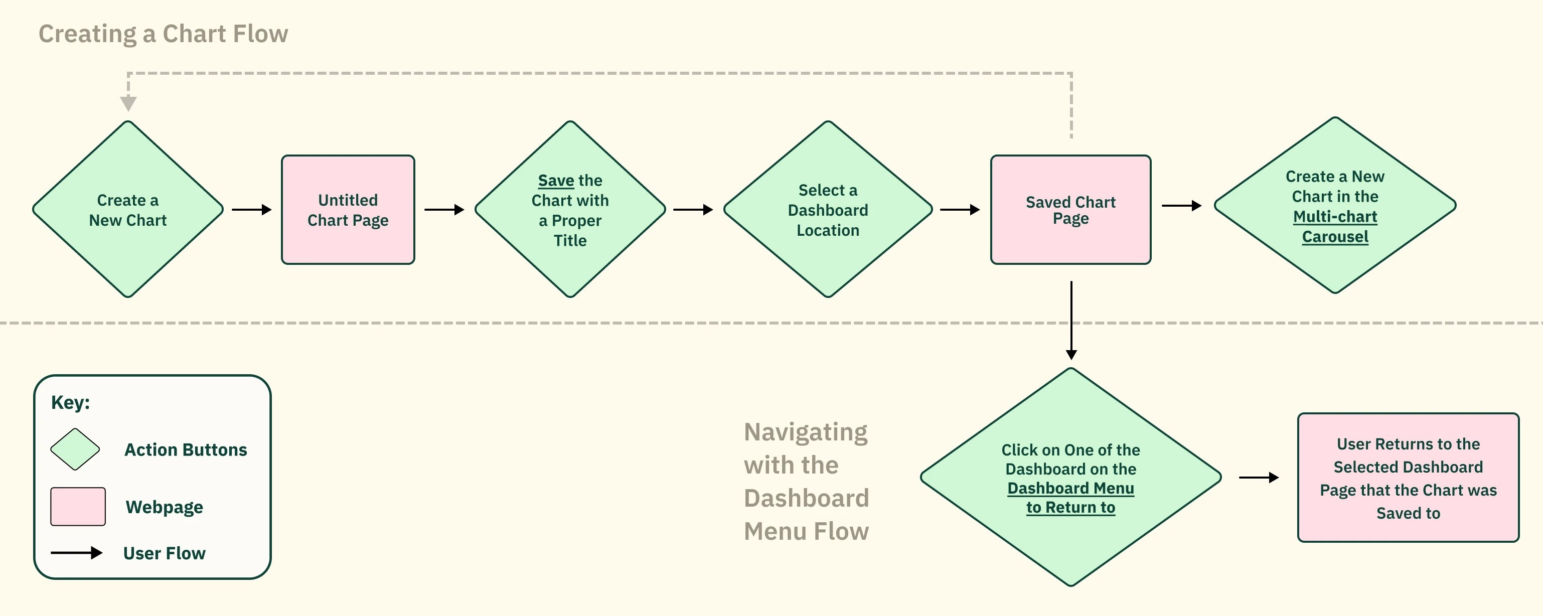
I mapped the complete user journey from login to payment confirmation. The primary goal was reducing the payment flow from 7 steps to 3 while maintaining all necessary compliance and verification requirements.
Payment details — smart defaults and auto-fill based on history
Review & confirm — all info on one screen with inline editing
Confirmation — real-time status with estimated processing time
Wireframing
I created wireframes for 18 key screens, starting with low-fidelity sketches and iterating to mid-fidelity grayscale layouts. Each round incorporated feedback from internal reviews and 2 rounds of guerrilla usability testing.
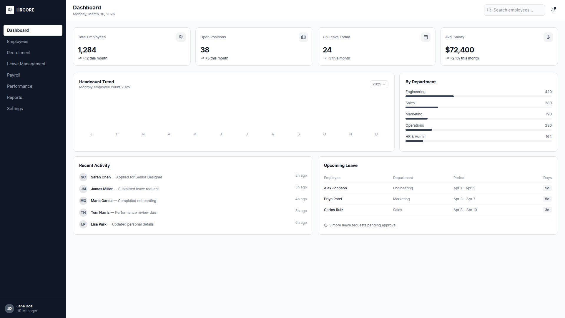
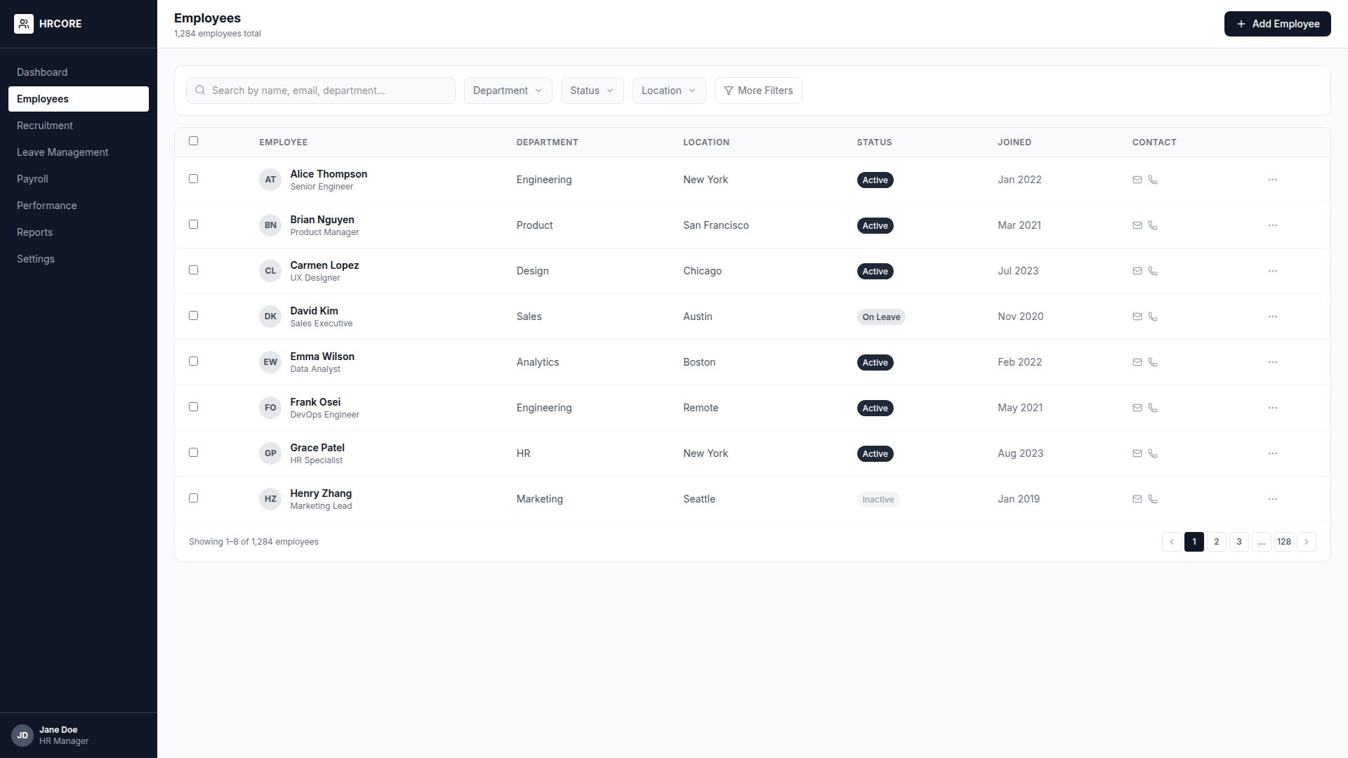
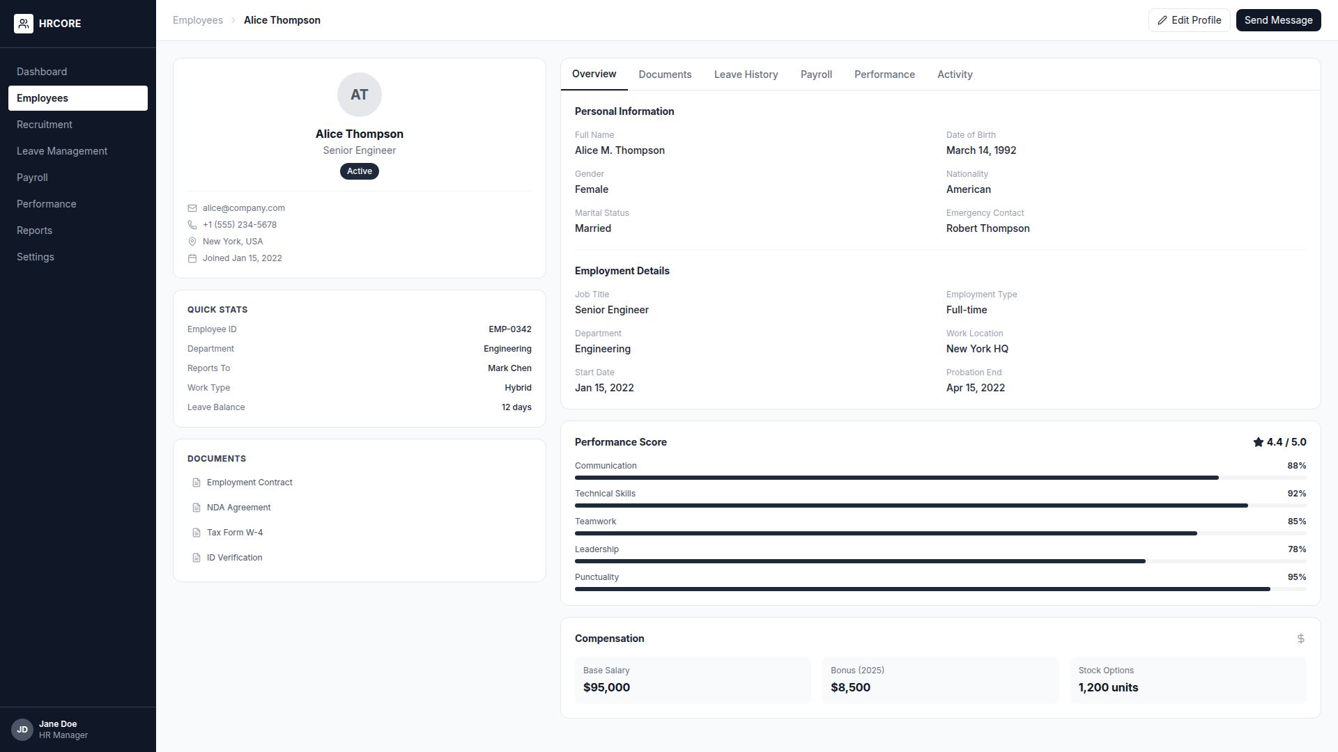
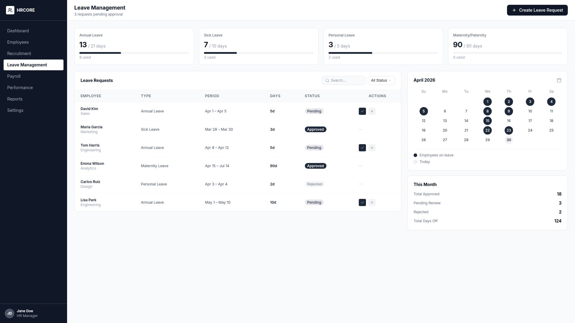
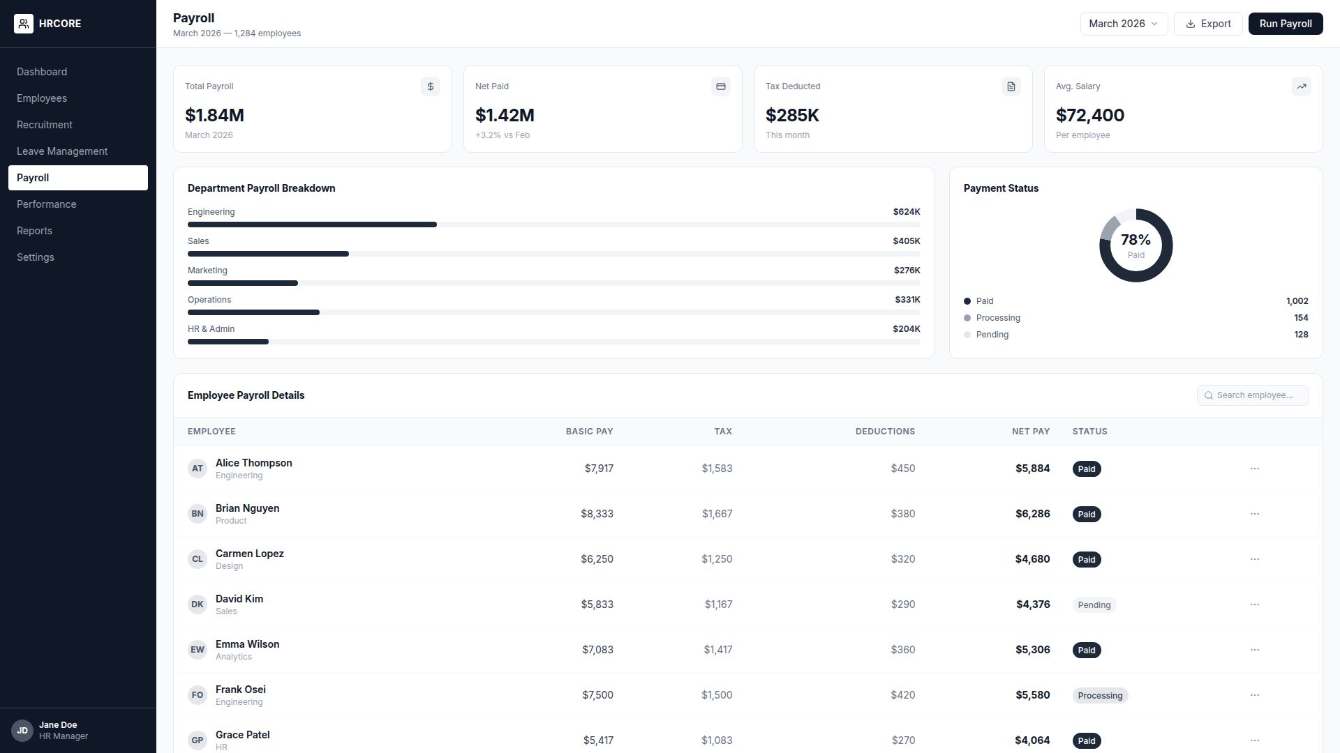
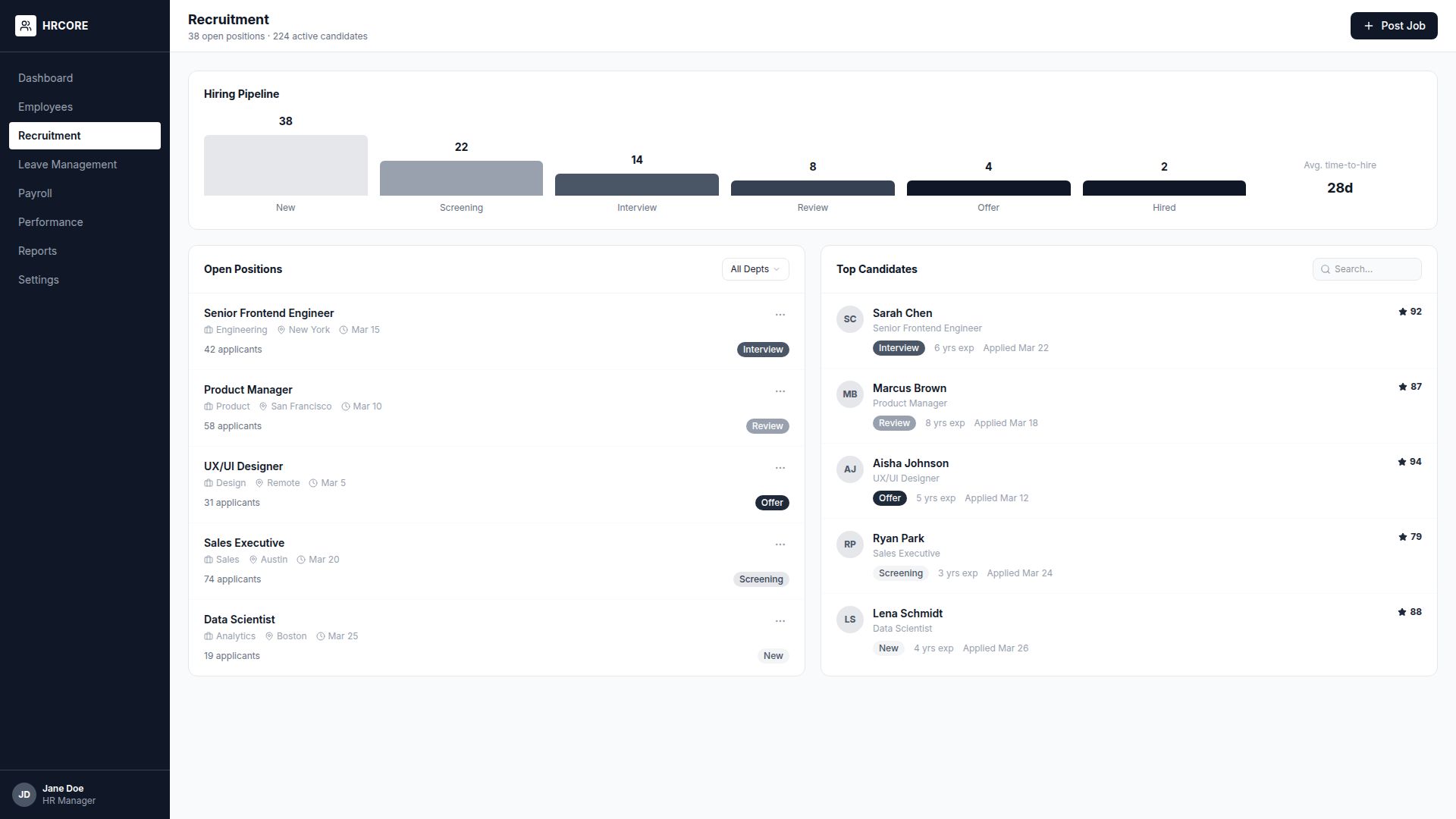
The final wireframes achieved a 92% task completion rate in usability tests, compared to 58% for the original design.
Visual Design
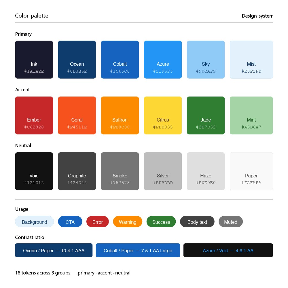
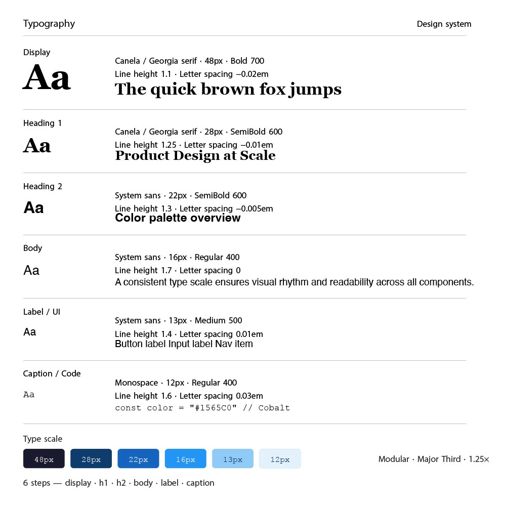
The visual design needed to balance professionalism (fintech) with approachability. I developed a clean, modern design system with a focused color palette and clear typography hierarchy.
Prototyping & Testing
I built a high-fidelity interactive prototype in Figma and conducted 4 rounds of moderated usability testing with 24 participants using Maze for unmoderated sessions.
24
Test Participants
4
Testing Rounds
95%
Task Success Rate
Iterations & Refinements
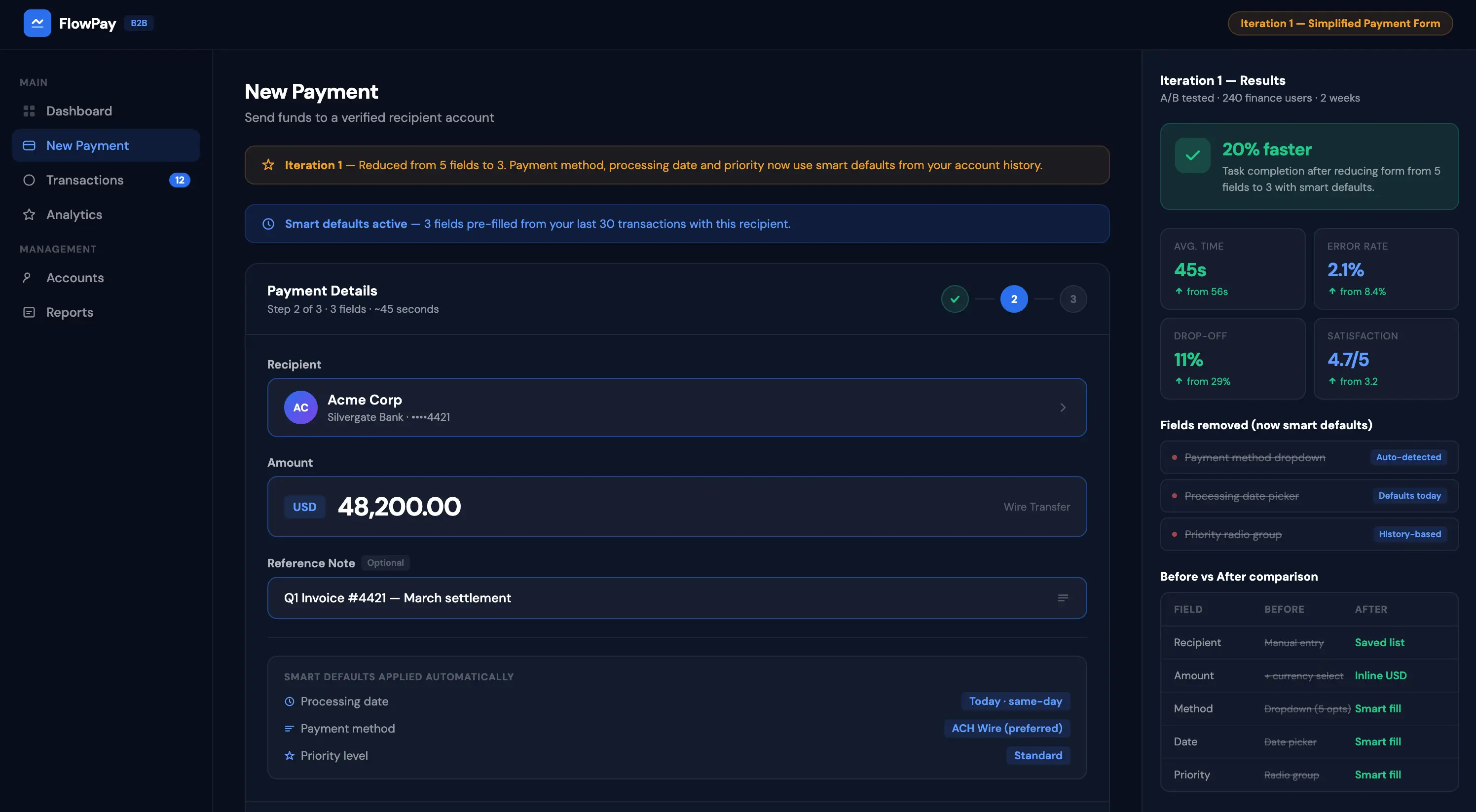
Iteration 1: Simplified the payment creation flow — reduced from 5 fields to 3 with smart defaults. Result: 20% faster task completion.
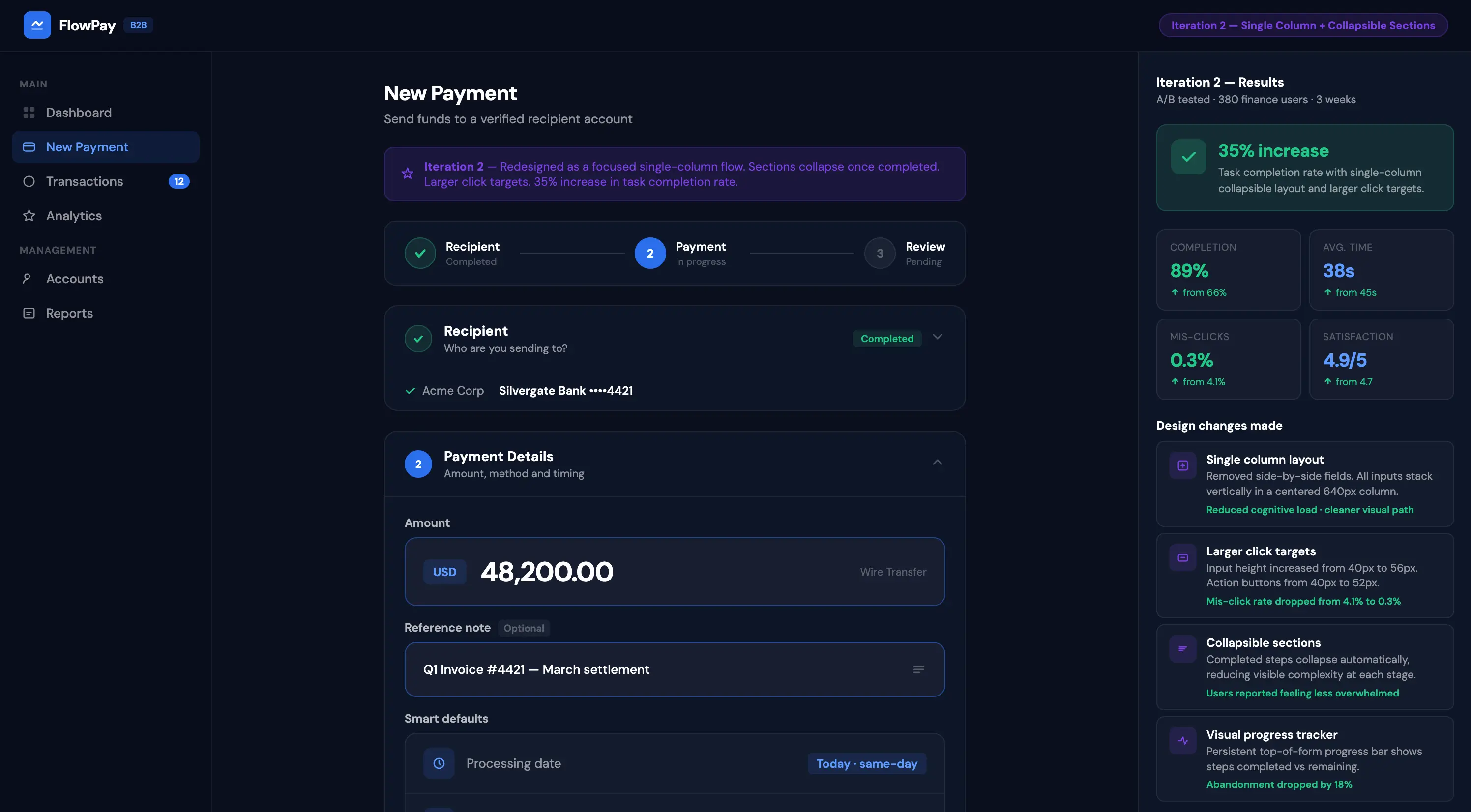
Iteration 2: Redesigned the mobile experience — single column layout with larger touch targets and collapsible sections. Result: 35% increase in mobile task completion.
Final Design
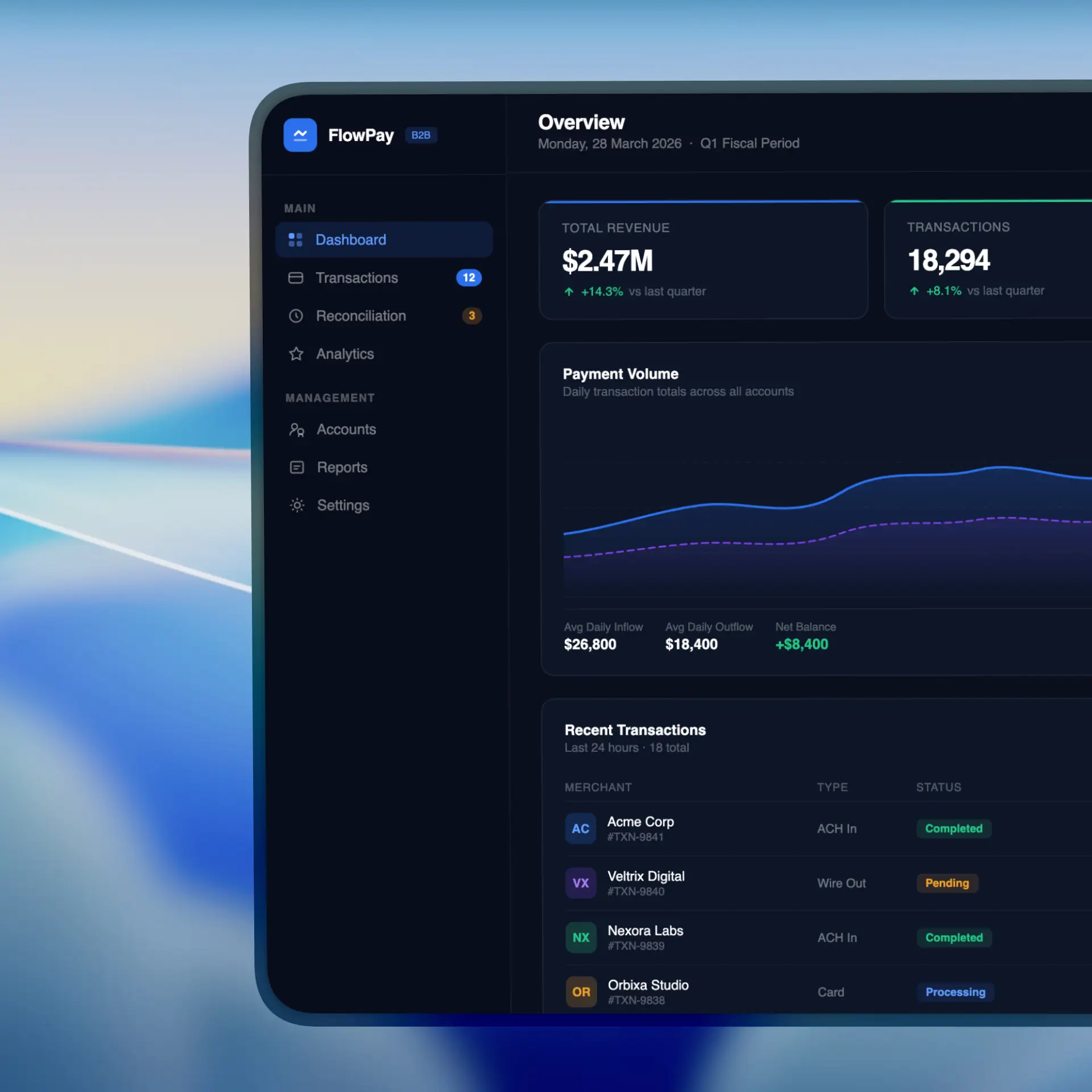
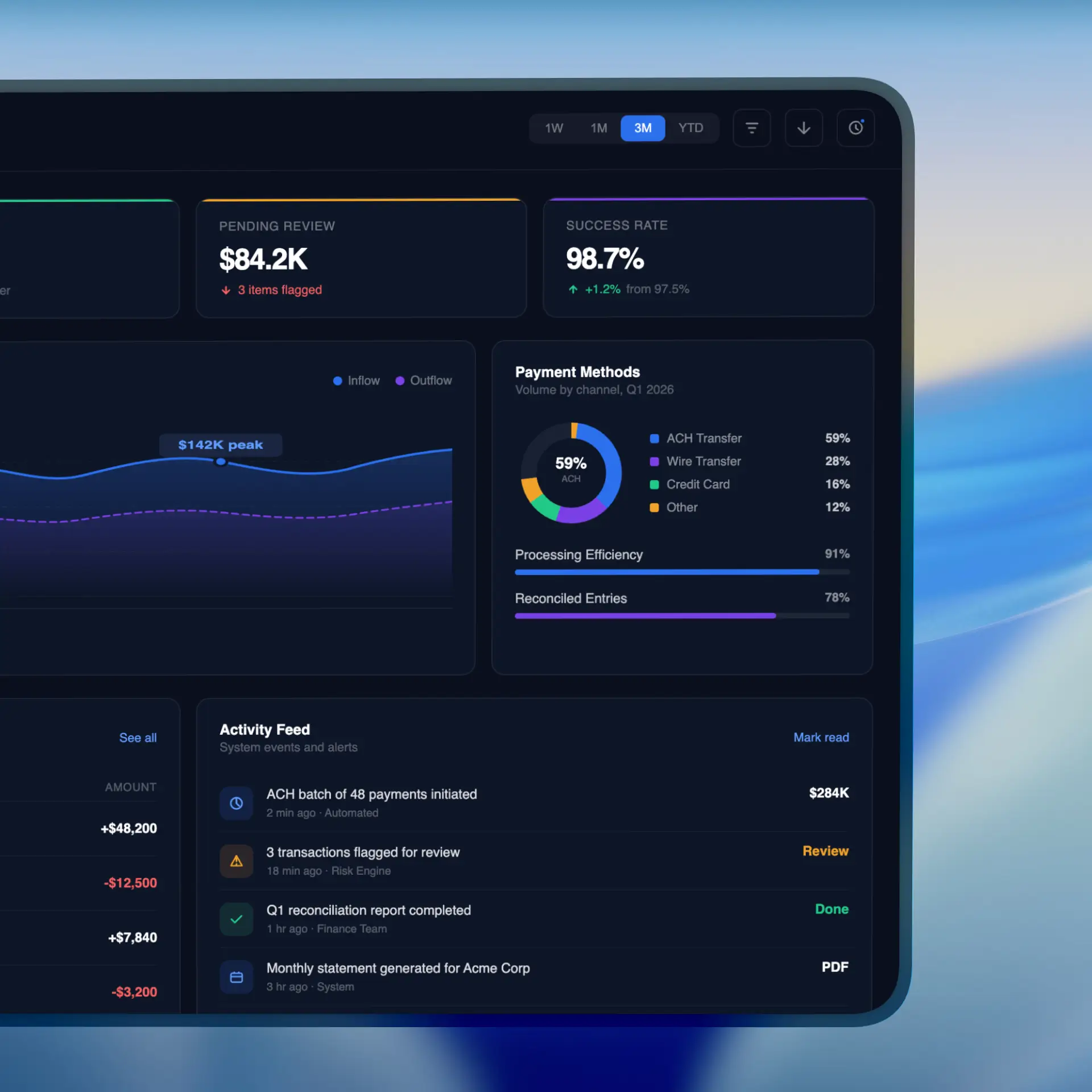
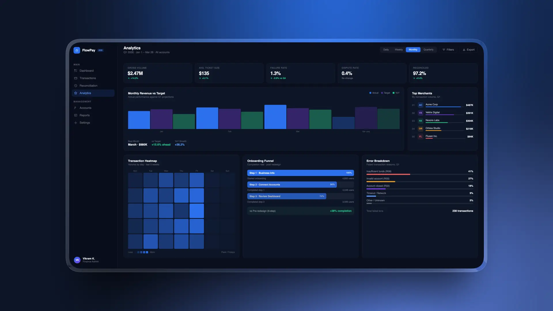
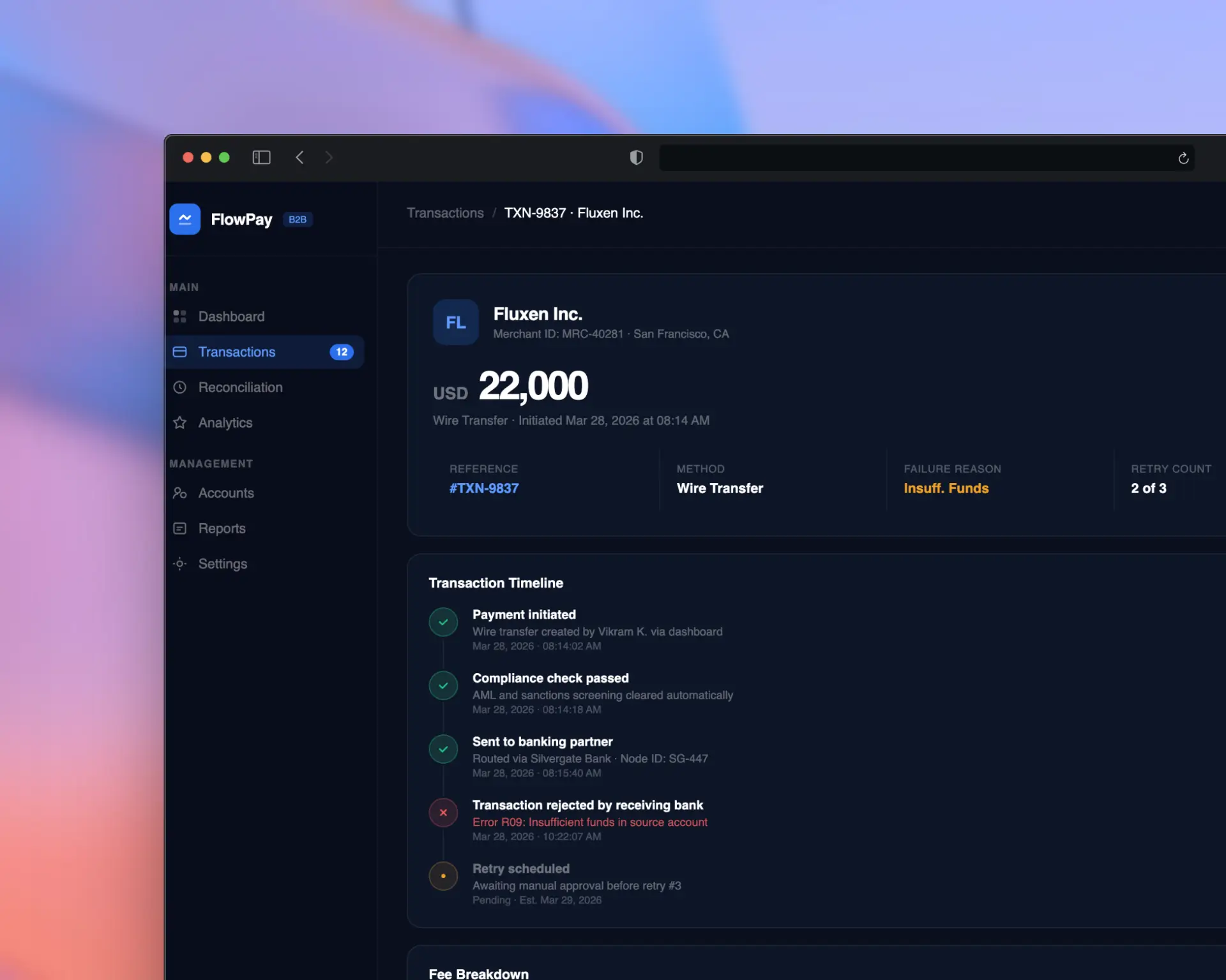
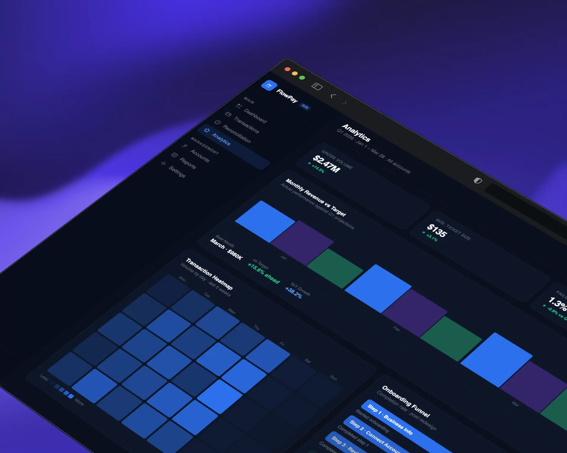
The final design, "StreamFlow," delivers a clean, confidence-inspiring payment experience across all devices. Key features include
3-step guided payment flow with contextual help
Real-time transaction tracking with push notifications
Bulk payment processing for enterprise clients
Customizable reporting dashboard with export options
Dark mode support with full WCAG AA compliance
Mobile-first responsive design with gesture navigation
Impact
58%
NPS Improvement
25%
On boarding drop-off
10
Support Reduction
The redesign paid for itself within the first month. Our support tickets dropped by 60% and customer satisfaction has never been higher.
Lessons Learned
Early and frequent usability testing saves months of rework later
Fintech users prioritize trust and clarity over visual flair
Mobile-first doesn't mean mobile-only — power users still need full desktop capabilities
Collaboration with developers early in the process leads to more feasible and innovative solutions
Next Steps
Implement AI-powered payment categorization and smart suggestions
Build out the design system into a shared component library
Expand analytics dashboard with predictive insights
Conduct longitudinal study to measure 6-month retention impact