
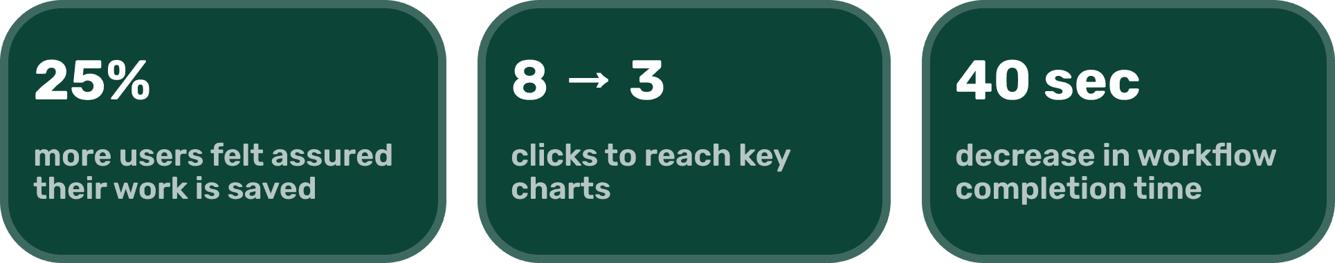
Results:
✏️ My Primary Role:
For four months, I served as a lead product designer for Amplitude through Cal Poly iter8, managing a six-person team to streamline the chart-to-dashboard workflow within Amplitude’s analytics platform.
In this role, I led my team through an end-to-end design thinking process and facilitated biweekly check-ins with Jingshu Zhao, Principal Product Designer at Amplitude, to drive alignment on priorities, scope, and deliverables.
💼 Company Background:
Amplitude is a leading digital analytics platform that equips users with charts and dashboards to better understand user behavior, identify trends, and turn insights into action.
RESEARCH
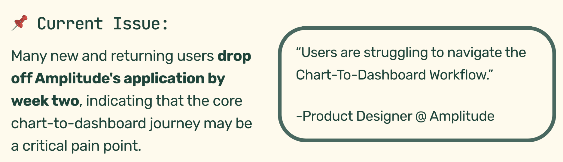
Hey Caitlyn, How Might I Design A More Intuitive Dashboard-to-Chart Flow?
Amplitude's main target audience is their employees so I chose to assess the current dashboard-to-chart experience by user interviewing seven Amplitude employees with diverse job roles and work experience (new, junior, senior level).
Observations From Interviews:
Over three weeks, we conducted 5 interviews with 7 core users, and identified 4 critical pain points:
Charts are often deleted because users forget to save their work.
1.05k users archived charts in the past 30 days, suggesting users are archiving unsaved charts too.
Key daily call-to-action buttons are hard to find.
Users open multiple tabs on their browser to work around slow chart load times
Where Can I Make the Biggest Impact?
We then used an impact–effort matrix to prioritize features to narrow down what features would bring the most value for both, the users and the business, within our time constraints.
It ultimately showed that we had to reduce friction in the chart-to-dashboard flow and make key call-to-action buttons more prominent and intuitive.

IDEATION
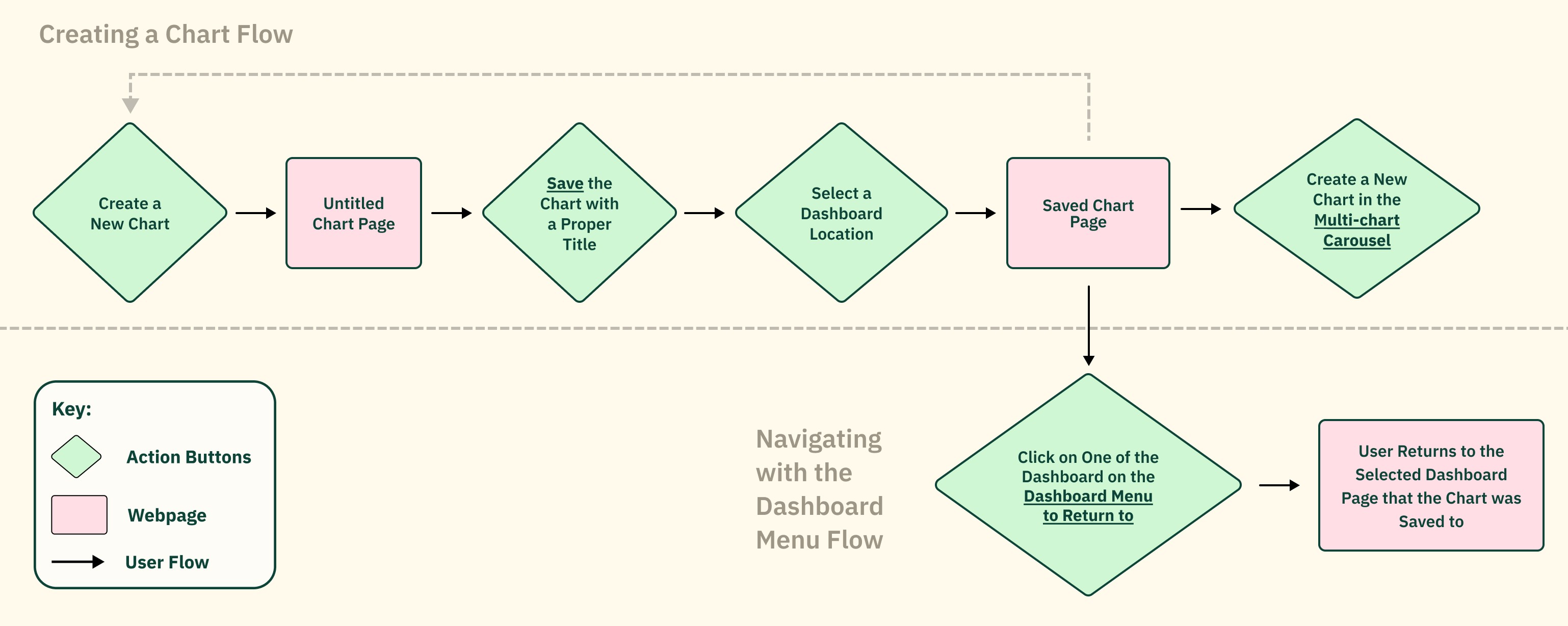
Manage Everything From A Single Page
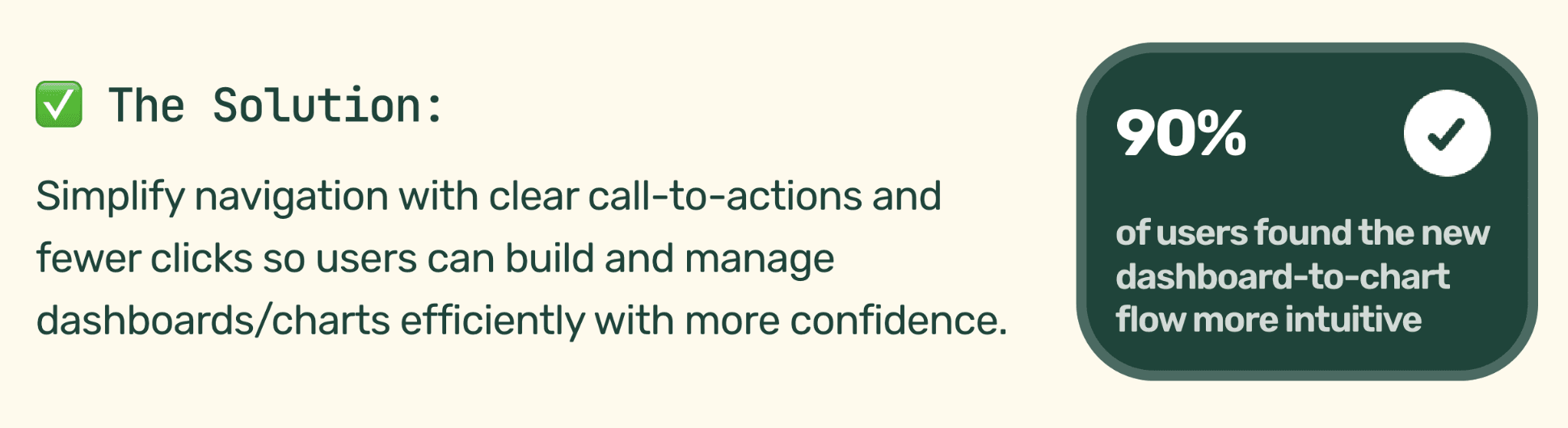
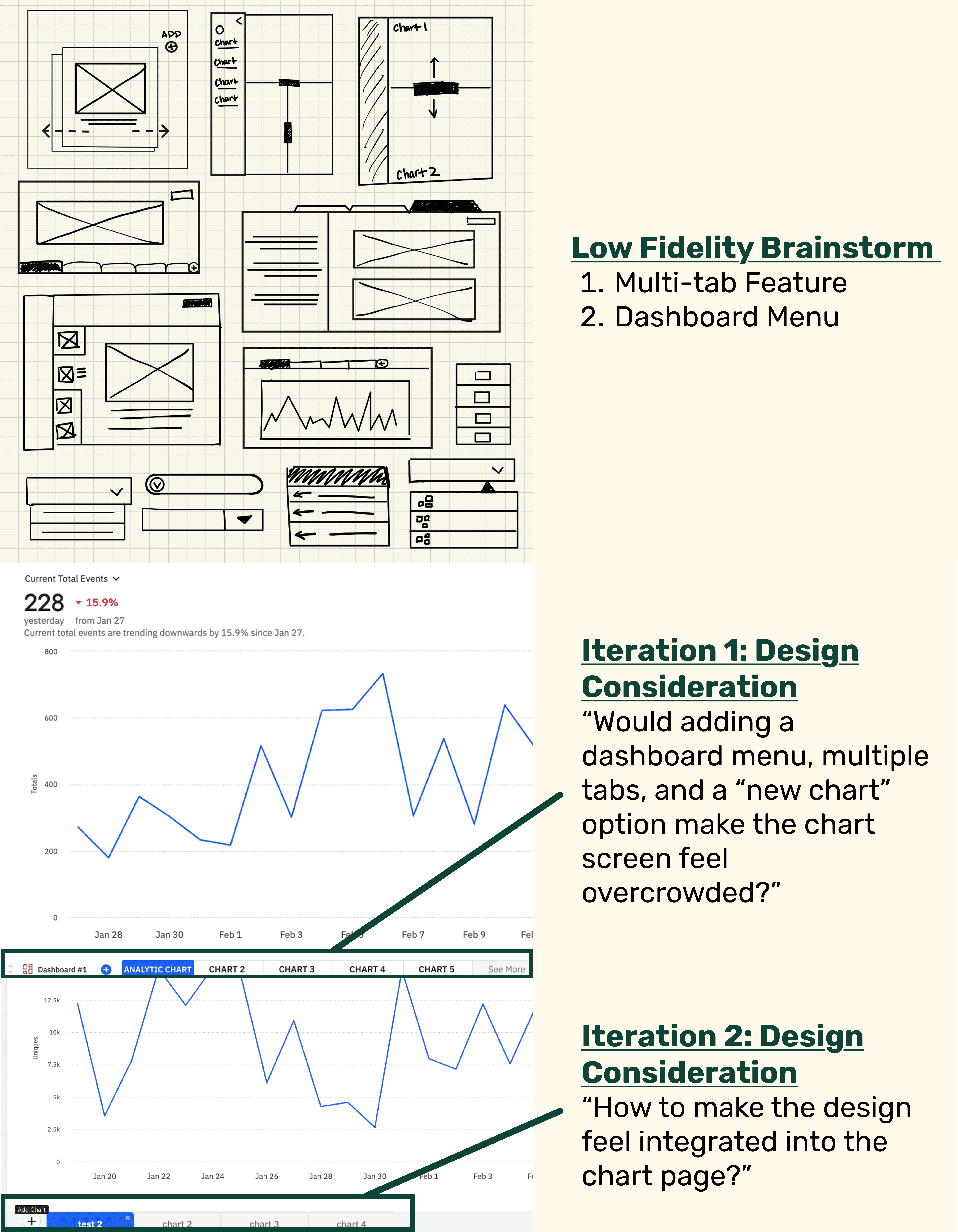
From carefully analyzing our user and business insights, I iterated lo-fi to mid-fi designs that focused on consolidating the experience into a single-page flow with more prominent CTA buttons, ultimately helping users spot trends and accessing tools faster.
TESTING & IMPACT
What were the users final thoughts?
To validate that the updated single-page flow addressed the original pain points, I conducted think-aloud usability testing with our initial users using a mid-fidelity Figma prototype.
The results showed a need to reduce the number of clicks required to reach key goals. So, to streamline the experience while keeping the flow intuitive, I implemented the following features into the high-fidelity:
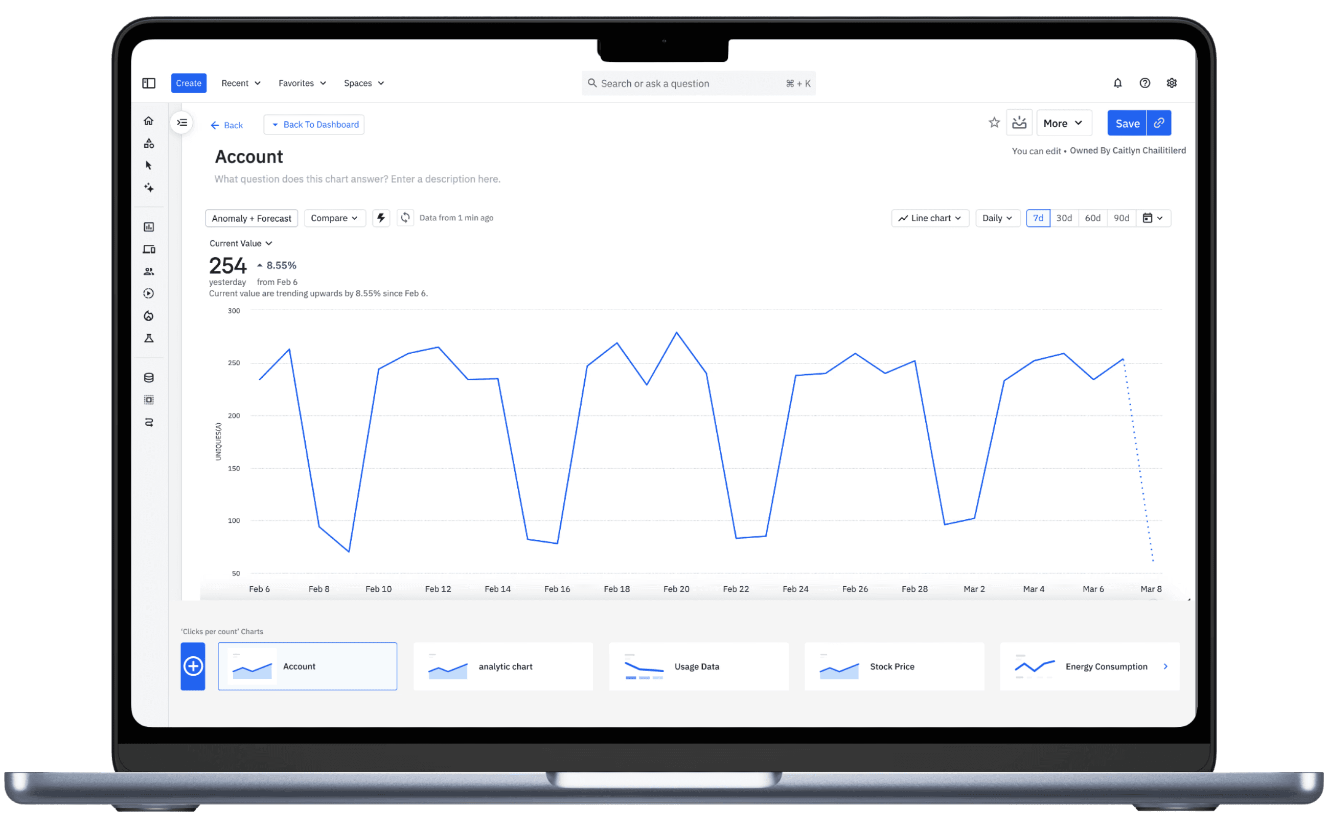
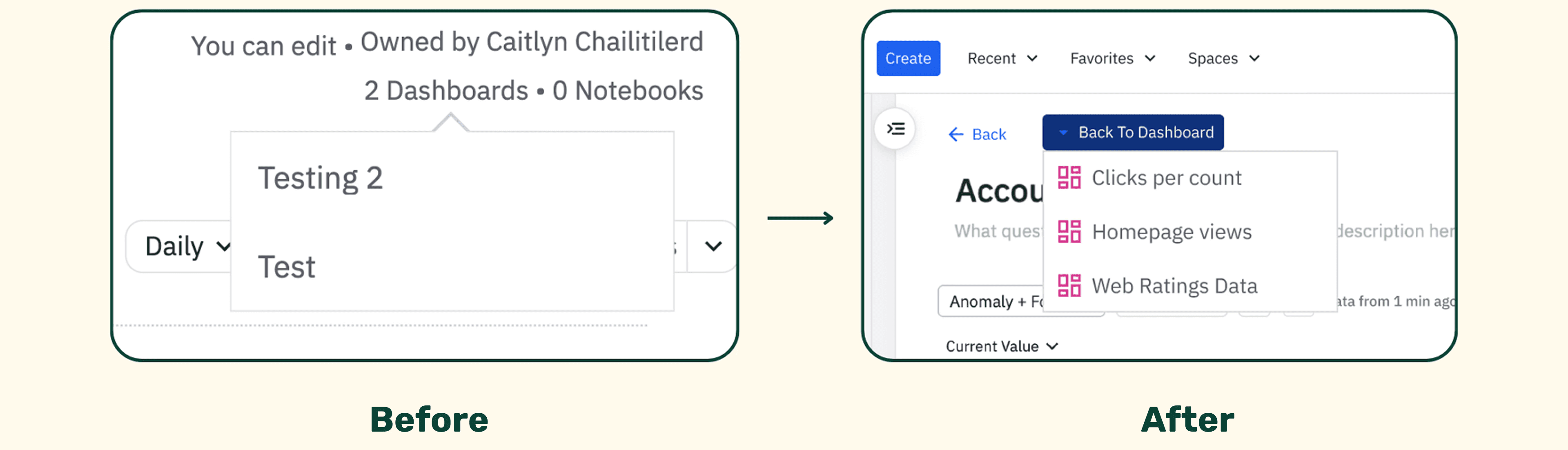
Navigate Dashboards in Seconds
Surfaced the Dashboard Organization button so it’s easier to spot.
Made chart-to-dashboard location clear so users know where each chart lives.
Sped up navigation by reducing search time.
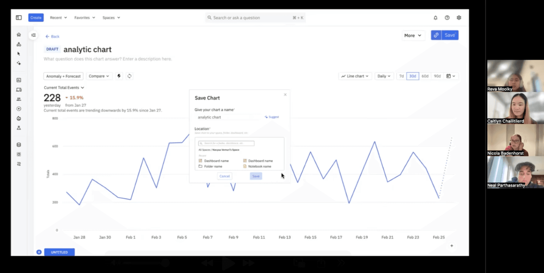
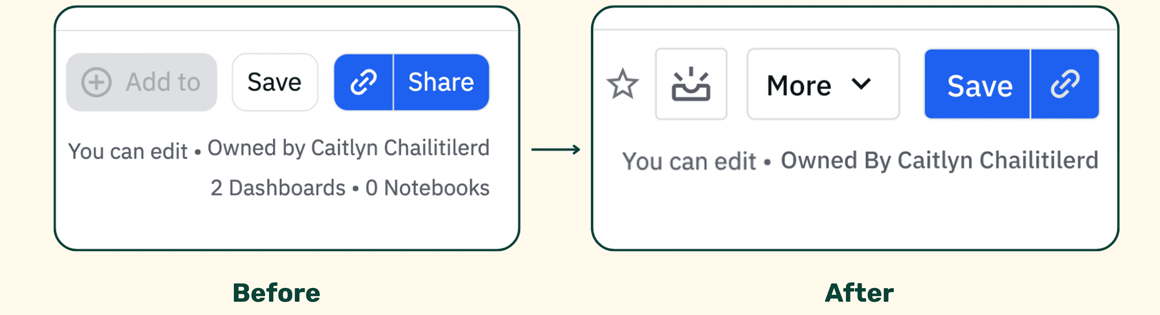
Save With Confidence
Made the Save button as prominent as the Share button to help prevent users from losing unsaved work.
Increased user confidence that their work is saved and secure.
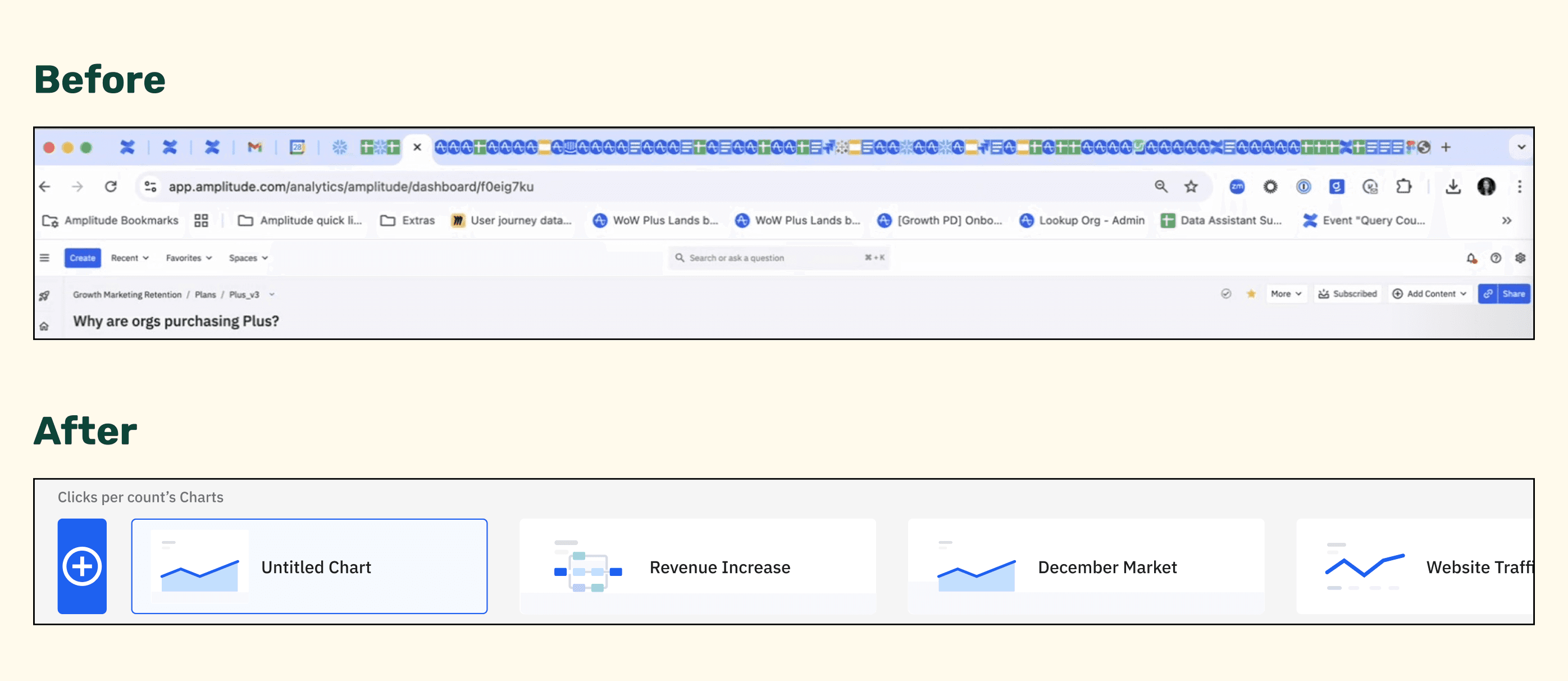
Fewer Reloads, Faster Chart Insights
Introduced a multi-chart carousel.
Shifted to a single-page flow so multiple charts are accessible for faster comparisons.
Reduced reload time by removing the need for multiple browser tabs.
FINAL LOOK
MY REFLECTION
Working with Amplitude reminded me how differently people can experience the same product. Because it’s used by people across various disciplines and skill levels, our designs had to feel approachable whether you were a senior data analyst or completely new to analytics.
Importance of Accessible Language: Like many new users, I found a couple of data terminologies confusing, which reinforced how crucial clear, accessible language is to become an intuitive interface.
Understanding limitations: Although it is easy to be ambitious and add more features to the program, I also had to understand the cost, time, and business value of implementing certain design choices. Thus, why it's important to be strategic in what brings value to both the company and user.


