Competition Overview
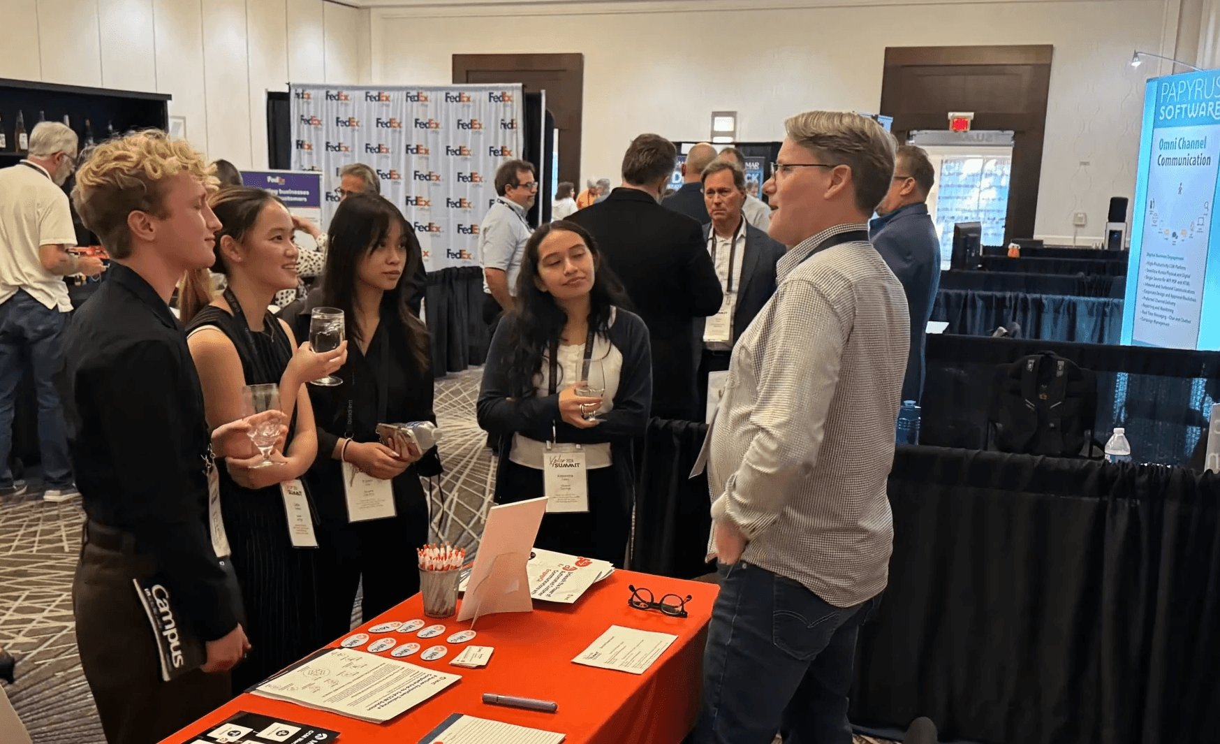
YesBank was presented at the Xplor International Conference, an annual customer communications management competition in Orlando, Florida. My primary role was creating YesBank’s mobile prototype alongside the required physical billing statement submission.
Prompt:
Each team is presented with the same ordinary, bland statement and accepts the challenge of redesigning it with the intent of making it more functional, compliant, and aesthetically pleasing.
Competition Brief
"YesBank is a fictional, financial establishment located in Michigan, focused on providing financial services that meet the customer's needs."
*The information below was provided by Xplor for use in this competition.

DEFINING
What is the problem?
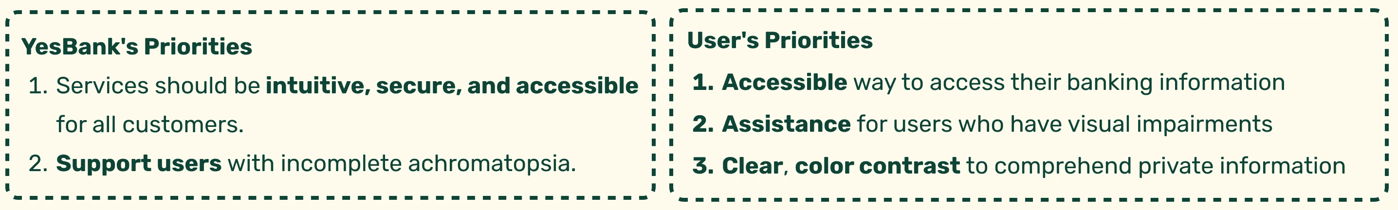
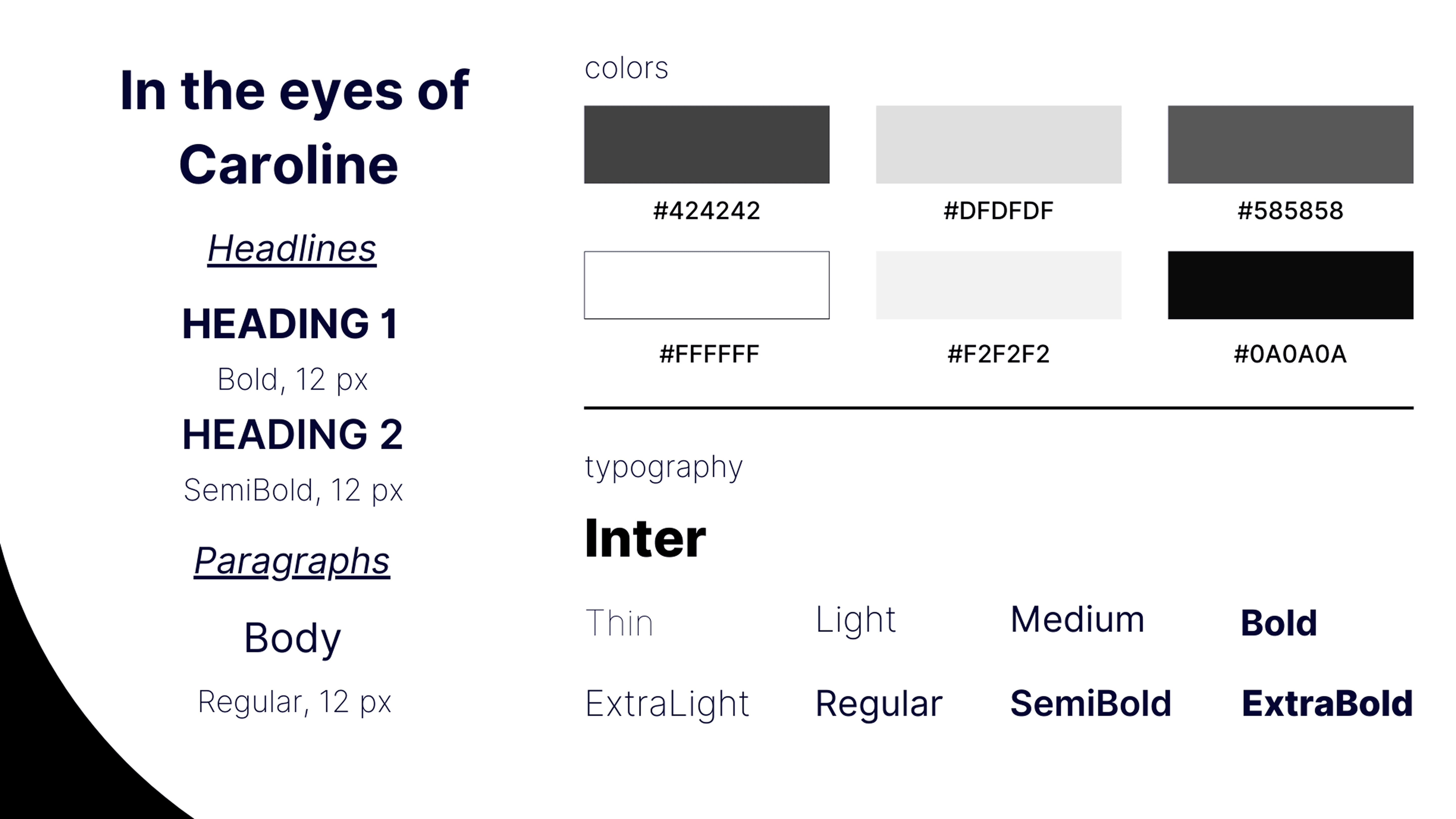
YesBank’s target users include customers with visual impairments, such as Caroline McCarthy, who has incomplete achromatopsia.
These customers want to access and manage their financial resources, but struggle to do so because their billing statements aren’t designed to be accessible for their needs.
2 Key Audiences To Keep In Mind:
Our Design Approach:
RESEARCH
Before we start designing, what key features make a bank account accessible?

Traditionally, people get their bank statements on physical paper. But is that truly the only way of accessing their banking information?
45% of U.S. consumers use mobile banking to access their accounts - American Bankers Association
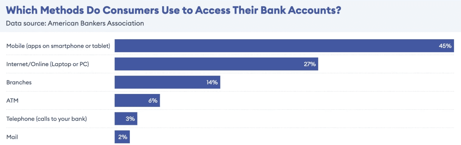
Since most users access their bank information on mobile, we added a mobile app prototype alongside the required physical billing statement to make financial services accessible to more customers.

Cleveland Clinic notes that people with incomplete achromatopsia commonly experience blurred vision and blind spots. To address this, we:
Provided auxiliary aids and services, such as voiceover features and AI assistance, on digital platforms (ADA.gov).
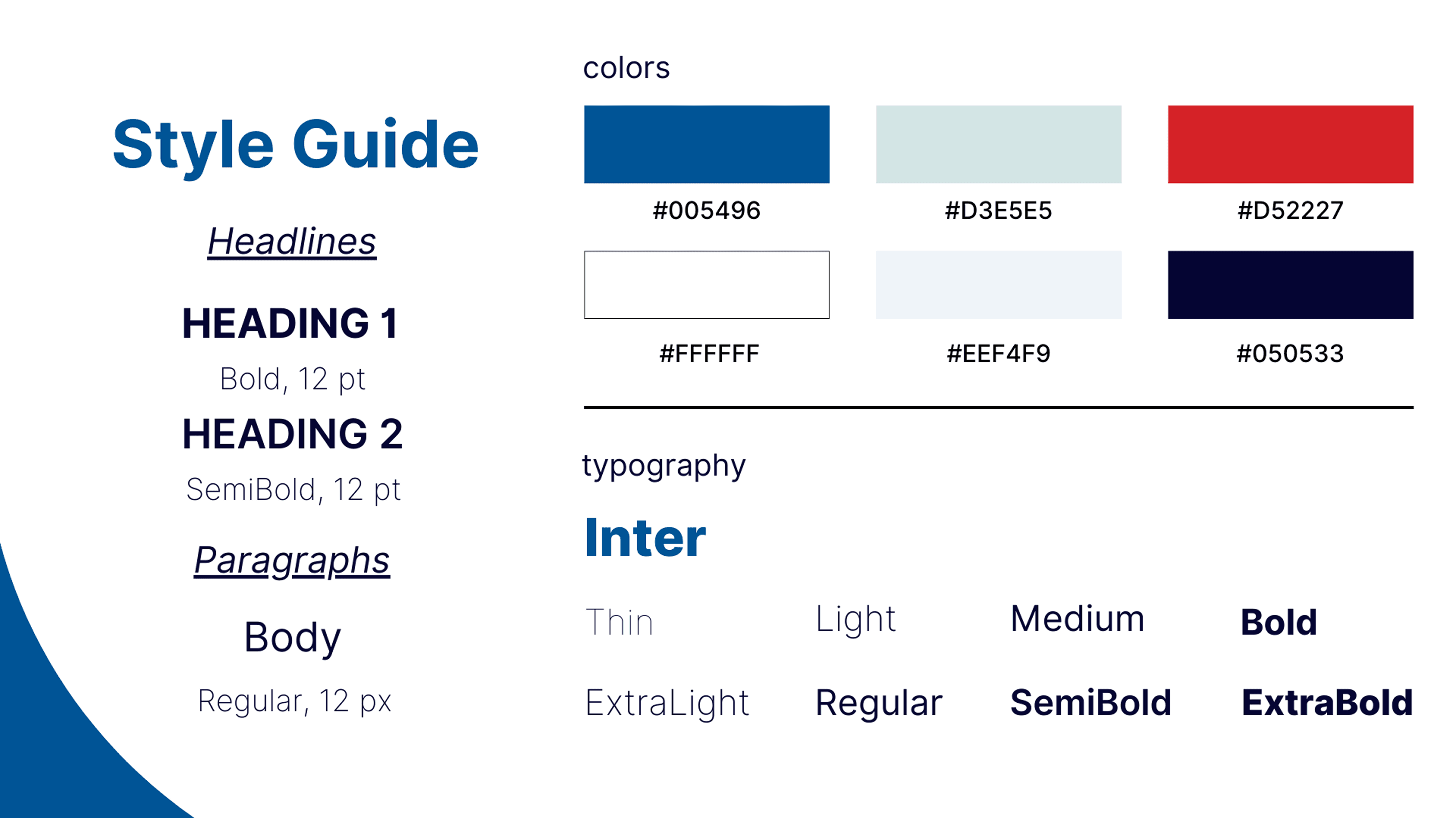
Used readable typography, including font sizes of at least 12 pt, to better support users with visual impairments.

WCAG emphasizes presenting information as clearly and simply as possible to support users with visual impairments.
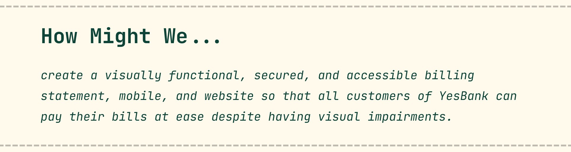
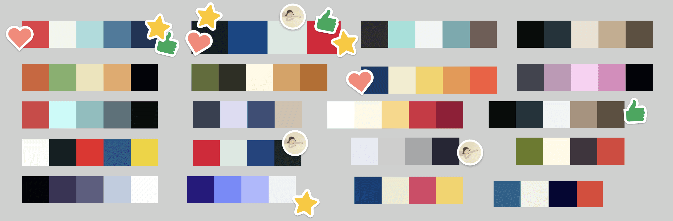
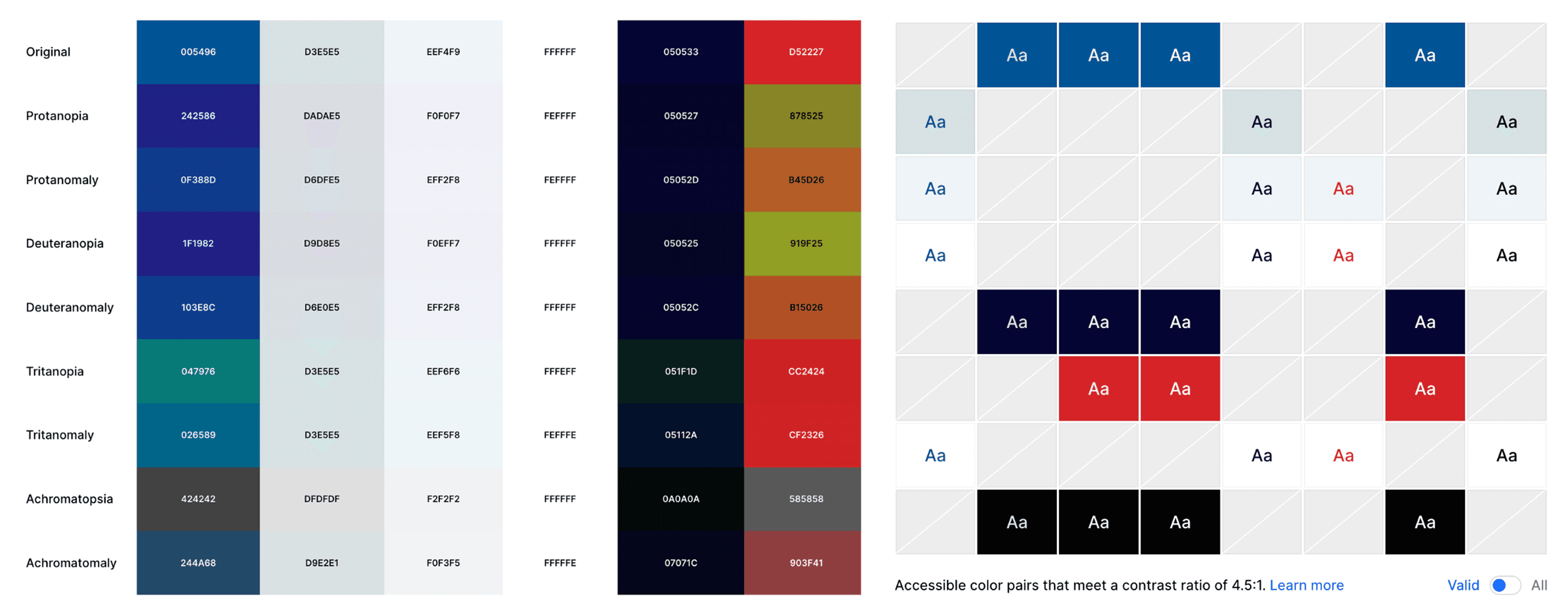
Based on our findings, we incorporated the following design choices:
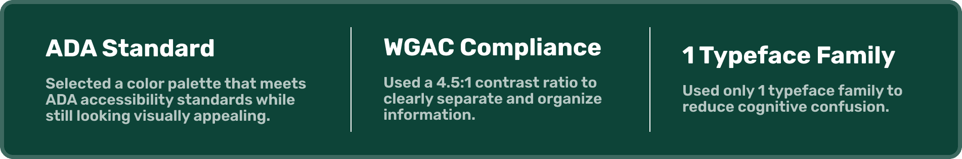
Our team brainstormed multiple color palettes with a focus on clear, quick comprehension for all users. After evaluating contrast options that aligned with YesBank’s purpose, we selected the palette that best met our accessibility goals.

INTRODUCING YESBANK
Transform spendings into opportunities that everyone can access.

MY REFLECTION
Designing for accessibility for the first time made me realize how many platforms still overlook inclusive features.
People’s needs vary, and this project strengthened my belief that everyone deserves equal access to essential information.
I really enjoyed working on this project because it deepened my understanding of how vital accessibility is across visual, language, literacy, and many other barriers — no matter the medium or interaction.